what the eyes don't see, the heart doesn't feel | 002.LOG
Hi! Toschi here. Before anything else, I want to really thank some of my friends that are helping me with some tips, text corrections and, last but not least, a LOT of moral support. Obrigado <3
In the last devlog, I was trying to convince myself to really make a game this time and my feeling after writing it is really the title of this article. If I want to feel the game that I am making, I need to visualize it. At least, visualize it more than two scrappy drawings that I made. So, this devlog is about me, being not a graphic designer, creating a visual mockup for Data Dungeons and trying to discover what the game will look like.
a e s t h e t i c s
All that I knew about the visual aspect of the game was that I wanted a cyberpunk, technologic feel to it, but not too realistic - so, I don't want a command line interface or something like that. I wanted that "hacker feel" but in a interface that you can just click in a button to do something instead of memorize dozens of commands. Beside that, I have another problem: I'm not really extremely good with CSS, so, I had to think in a interface that I can code after too.
I went to Google and start searching for inspirations: "cyberpunk interfaces", "hacker UI"... I found some really good design styles that are difficult to code and a lot of terminal styles that are difficult to use. So, I tried something different: searching for real, old computer interfaces, like DOS and Commodore. I'm a fan of old technology and, because of the limitations of the computer graphics in the past days, they will not be hard to mimic in my mockup.

Searching through them, I really like the DOS interfaces. I think that was because they remind me of my childhood - yes, I'm only 21 years old, but my dad teached me how to format my computer since I was 8, in the classic Windows 98, so I used a lot of DOS programs and learned some of the command line terminal. One more search give me Perfect DOS VGA 437, a font based on the classic DOS look made by Brazilian (!) designer Zeh Fernando. It's a perfect recreation of the aesthetic, like I remember seeing in my old PC. That's it.
I had the inspiration, the font and the memories. So, I started my try on create a fantasy-DOS interface for a dungeon riddle game. (sounds more ridiculous when I say in this way, I think)
piece by piece
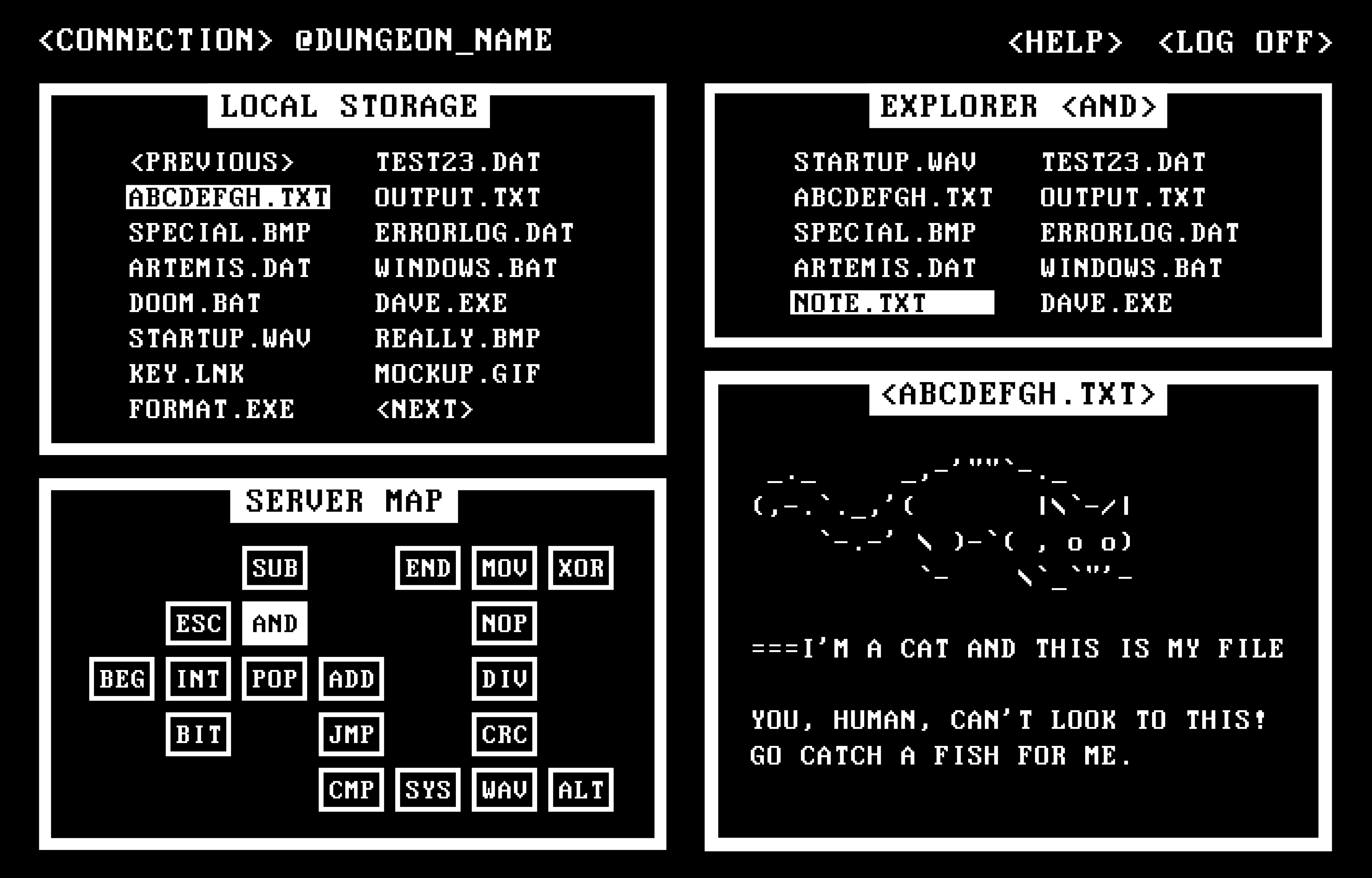
The only thing that I have defined was what will be showed in the screen during the game and what are their functions:
- The Server Map, a more simple Zelda-like minimap to show the servers that were discovered and the one that the player is connected currently;
- The Local Storage, an "inventory" of all Text Files that the player has opened;
- A server file explorer, a location to search for important Text Files and Programs;
- And a program screen, somewhere in the screen to show the content of those files.
(I want to the rest of this text make sense to you, so, that's my mockup to Data Dungeons:)

Like I shown in the last devlog, I only have solid ideas for the Server Map - the other ones were a mystery to me - so, I started with it and defined the visual for the boxes, the thick border and the white rectangle title. Originally, the servers won't have names, but I decided to use 3 character names because of the original sketch. This is the pattern for DOS filename extensions and some Assembly instructions, I think that fits with the whole theme. To indicate the actual server, I painted the rectangle. It's really charming, I think.
The next thing that I made was the Local Storage. In my head, I imagined that each file would have an icon indicating your type (a document icon for a Text File, a hyperlink icon for a Port Link, etc.), but... DOS doesn't have icons, right? They seems out of place when I saw the mockup at this point. So, taking for the servers' names, I decided to use the pattern for DOS filenames, 8 characters + 3 for the extension. In the place of the icons, I will use different extensions (like TXT or DAT for Text Files).
The white rectangle indicating a opened file cames later, but it works really well. The Local Storage was the first time that I used angle brackets for context buttons, like <NEXT> and <PREVIOUS>. Some of the screenshots that I have found use this notation for menus and I liked it. The things in the top of the screen were born in this moment, together with the fact that dungeons have @NAMES now.
Sincerely, for the server explorer, I just copied the Local Storage design (and I didn't even change the file names). I put the selection there to show that the rectangle size is fixed, even if the filename is smaller, but just one of them will be showed at a time.
And last was the program screen. Until this moment, my idea is, in the future, to show even images and videos as clues for the riddles inside that box, but looking at the design... It just doesn't fit. This resulted in two new decisions about the game: (a) the first dungeon will have only text clues; and (b) I will use ASCII art A LOT. I still need to think how I will create buttons and input fields for the program in there, but probably will be, respectively, <texts like this> and a white thick line.
And it's done. Now I feel what I'm doing. A riddle game. Or better: my fantasy-DOS dungeon riddle game.
the next step in the rainbow
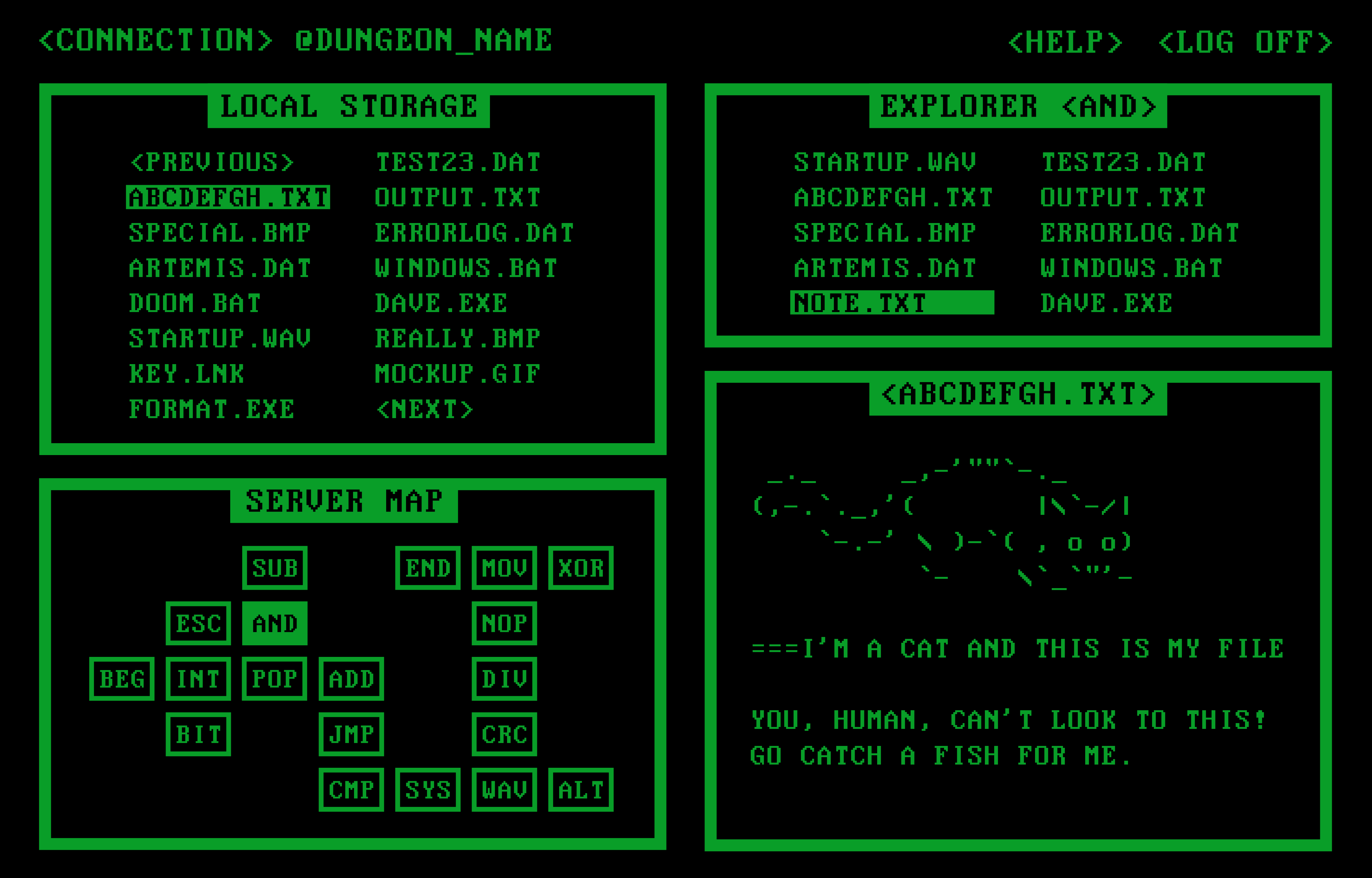
Just for the sake of science, I decided to change the white color to a phosphorus monitor green. I love monocolor designs like these exactly because of the idea to change colors and not losing anything of the meaning. That's the result:

Yeah, I know that I would have used a more vibrant green to make reading easy, but it was 1AM and work every day at 8AM, so... It's just experimentation, right? But this gave me a new idea: each dungeon will have a different color palette, to create the atmosphere around its theme. I hope I can do this.
And for do this, I need to begin coding, that's the next step. Probably the next log won't be so fast to produce because writing computer code take time... I will try to make general components, like the box that all the components have inside and modularize each one. To organize the game, there's some architectural decisions to be made too. Data Dungeons is being born!
Until next time.
Toschi
Data Dungeons
| Status | Released |
| Author | Gabriel Toschi |
More posts
- the start of a something (almost) new | 001.LOGMar 24, 2020
Leave a comment
Log in with itch.io to leave a comment.